Site Revamp - Learning Visual Design
It’s surprisingly hard to teach yourself visual design.
If you are learning to code, there are myriad courses, guides, and tutorials which provide rich context for the concepts and a roadmap for gaining new skills. If you trying to improve your intuition for design, there are far fewer resources. While there are some great overviews for narrow topics, there is little help for someone trying to build a broad intuition for design.
Site Redesign
I am currently redesigning my website - different from this blog - something I’ve done roughly once a year since I started learning to code. With each iteration, I try to learn something new. For the first version, I was just playing with the basics of HTML/CSS. Last year I focused on JavaScript and incorporated animations and tabs to create a single page website. I also found Bootstrap, which I now use for everything. This year, I’ve sought to hone my design sense.
I don’t have any formal training in design and don’t consider myself to have any innate knack for it. While I’ve read up on the basics of color theory, typography, and information architecture, I’ve felt lost when it comes to implementing the different concepts in unison. Part of the issue is a lack of deep intuition; I know some general heuristics about how to select a color scheme or what fonts to use but I don’t always understand the reasoning behind it.
Looking for Advice
As I redesigned the site, I turned to two friends for advice. Early in the process I spoke with David Yanofsky, who encouraged me to explore flat design and pointed me toward this site. I like the flat design aesthetic and it made me wince at the gratuitous use of textures and shadows in my previous iteration.
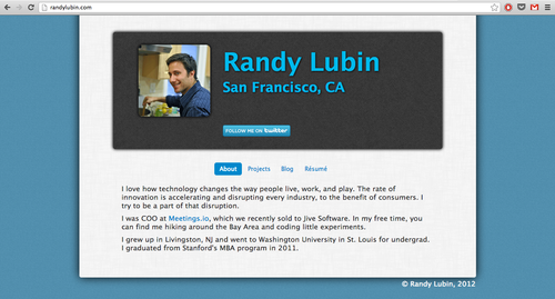
David also nudged me to use responsive design and to maintain information consistency across the various views (at first I had slight different content for web vs mobile). Responsive design turned out to be very easy to implement as Bootstrap contains some degree of responsiveness by default and it is easy to modify the settings to your needs.
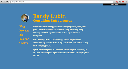
Once most of the site was in place, I talked with Raph D’Amico about color scheme. My first pass at color selection was just based on picking a nice color blue for the background and then choosing the complementary orange as an accent color; it didn’t quite work but I had no idea why.
Raph explained to me the importance of brightness / saturation when considering colors. Some tips he suggested were:
- If two sections of the page have equal presence and importance, consider using equivalent intensity and complementary colors to bring a sense of balance
- If the elements are unbalanced on the page, consider desaturating either the primary or the secondary color
- Often you only need one alteration to effectively delineate different parts of the page. For example the only change between navigation text and body text could just be color or font or size, not necessarily a combination of the three.
- Just because two colors are opposite on the color wheel doesn’t mean the human eye perceives them equally; adjust the intensity of a color to compensate for biological interpretation
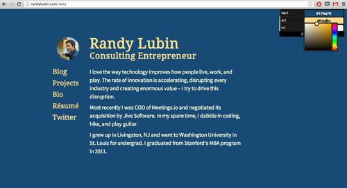
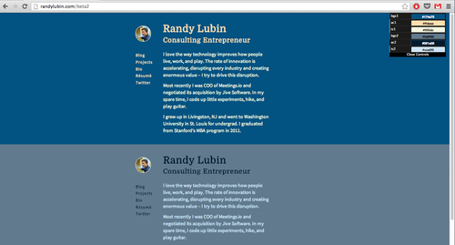
I decided to focus in on point two because the headers were relatively out of balance with the vast background. As I played with the colors, I was frustrated by the slow process of updating the code and refreshing the page. Fortunately, Raph showed me a great tool: Dat-GUI. Dat-GUI provides a console in the corner of the page where you can easily adjust any part of the page. I customized it to adjust the background, accent, and body colors. Then I was able to play with different color combinations with complete ease. On Raph’s advice, I took it further and created a page with two versions of my site next to each other and corresponding Dat-GUI controls. This allowed me to quickly compare different options.
Final Touches
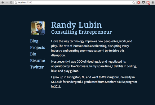
Ultimately, I moved away from the complementary orange accent coloring; for reasons I can’t articulate, it just wasn’t working. I settled on an all blue palette. There are still some tweaks I have to make but the site is now live at randylubin.com; I also ported the color scheme to this blog and my Twitter account. It’s definitely not amazing but I think it’s a significant step forward; I’m looking forward to continuing to learn design.
Any further feedback would be much appreciated!
Resources
If you’re looking to further your design intuition, the best options is probably sitting down with a friend who is great at design. With that said, here are some tools I’ve used and enjoyed.
If there are other resources you like, let me know and I’ll add them to the list.