Story Synth Visual Refresh
Over winter break, Raph D’Amico helped me refresh Story Synth’s look and feel. You can check it out at storysynth.org – I love how it turned out!
First up, there’s a sharp new logo:
![]()
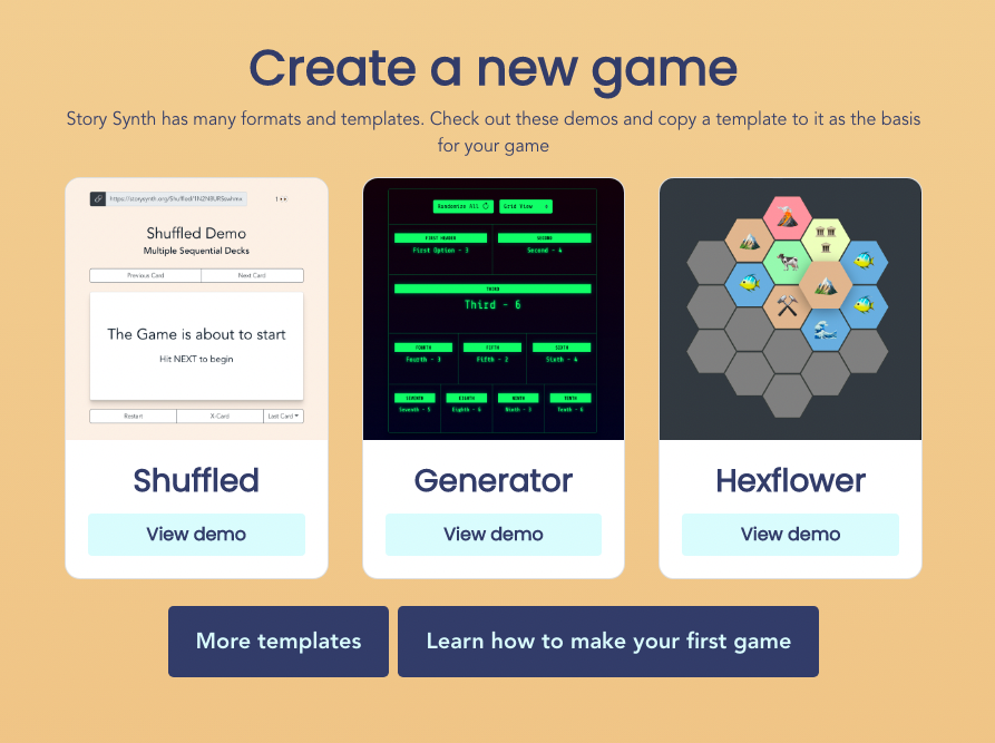
We gave the homepage a complete redesign and it looks much more modern and professional than the previous iteration. The new styling carries over to the Gallery page and the new Formats page.
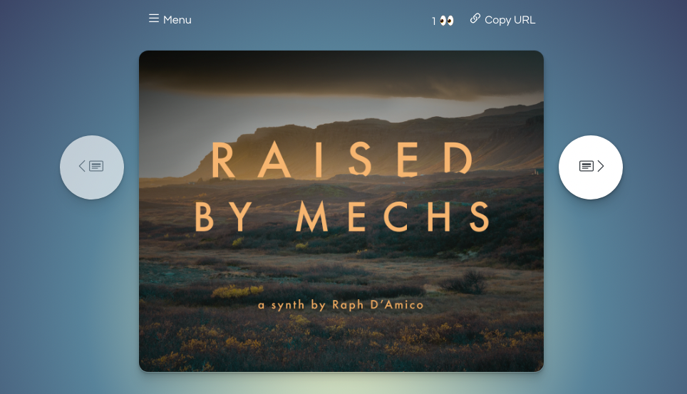
Finally, we redesigned the in-game “session” pages. The previous and next buttons now float alongside the cards on big screens, and underneath on small screens. All the other buttons now live in a menu modal, accessible from the top of the screen. This is a huge improvement over the cluttered look of the old interface.
Collaborating with Raph on this redesign was a massive treat for me. His process, design sensibilities, keen eye, and deft CSS skills made all the difference – every step was a complete delight!